Chart indicators on Legend
Technical indicators on Legend allow you to visualize price data and market trends using mathematical calculations, and can help you make informed decisions before placing your next trade.
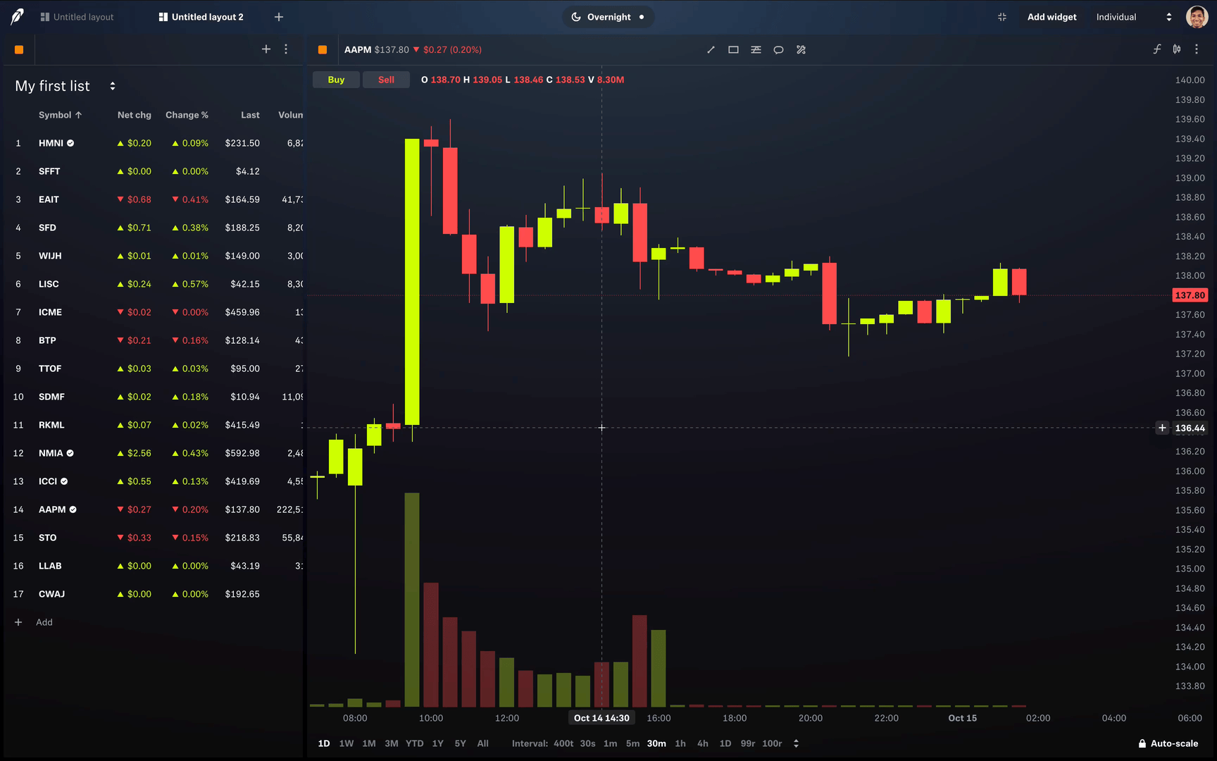
To add indicators to your chart widget, select the indicator icon in the upper right hand corner of the widget and select the indicator(s) you’d like to add.
You can also create and save your own indicator template to apply the same set of indicators to multiple chart widgets.
To create an indicator template from the chart widget:
- Click on the Indicators icon to open the indicator menu
- Add the indicators you want to include in your template
- Click on the folder icon at the top-right of the indicator menu to save your chart's current indicators as a template
- Name your template
To apply an indicator template to a chart widget:
- Click on the indicator icon to open the indicator menu
- Click on the folder icon at the top-right of the indicator menu and select the template you want to apply to your chart
Here’s a complete list of indicators you can add with descriptions below:
- Acceleration / Deceleration (AC)
- Accumulation/distribution (A/D)
- Aroon indicator
- Aroon Oscillator
- Average directional movement index (ADX)
- Average directional movement index rating (ADXR)
- Average true range (ATR)
- Awesome Oscillator (AO)
- Bollinger Bands (BOLL)
- Chaikin Volatility
- Commodity Channel Index (CCI)
- Daily Open-Close
- DeMarker (DeM)
- Directional movement index (DX)
- Double exponential moving average (DEMA)
- Dynamic Momentum Index (DYMI)
- Exponential moving average (EMA)
- Exponential moving average envelope (EMA envelope)
- Fast stochastic oscillator
- Forecast Oscillator (FOSC)
- High-low volatility
- Ichimoku Cloud (ICH)
- Inertia
- Intraday Momentum Index (IMI)
- Keltner Channels
- Linear regression channel
- Linear regression curve
- Linear regression slope
- Mass index
- Momentum
- Money Flow Index (MFI)
- Moving average convergence/divergence (MACD)
- On-balance volume (OBV)
- Parabolic SAR
- Percent change
- Pivot points (PP)
- Price channel
- Price volume trend (PVT)
- Rate of change (ROC)
- Relative strength index (RSI)
- Relative volatility index
- Schaff Trend Cycle
- Simple moving average (SMA)
- Simple moving average envelope (SMA envelope)
- Slow stochastic oscillator
- Smoothed moving average (SMMA)
- Smoothed moving average envelope (SMMA envelope)
- Smoothed rate of change (SROC)
- Spearman
- Standard Error Bands
- Standard deviation
- Standard deviation channel
- Standard deviation volatility
- Stochastic oscillator
- Stoller Average Range Channel Bands (STARC Bands)
- Time series forecast (TSF)
- Triangular moving average (TMA)
- Triple exponential average (TRIX)
- Triple exponential moving average (TEMA)
- True strength index (TSI)
- Ultimate Oscillator
- Volume-weighted average price (VWAP)
- Weighted moving average (WMA)
- Weighted moving average envelope (WMA envelope)
- Williams Alligator
- Williams Percent Range ( Williams %R)
- Zig zag
Not every technical indicator is available for each asset type.
Acceleration / Deceleration (AC)
Acceleration / Deceleration (AC) gauges momentum changes in the market and may provide early signals of potential trend reversals or trend continuations. It measures the acceleration or deceleration of the current trend based on how fast the price is changing.
Generally, if the AC is positive and increasing, it suggests that the upward trend may continue. If it’s negative and decreasing, it may suggest the continuation of a downtrend. Conversely, a change in the histogram's direction may indicate a potential trend reversal. A positive to negative change may indicate that a bullish trend is weakening, suggesting a possible bearish reversal. A negative to positive change may suggest that a bearish trend is losing momentum, and a bullish reversal may be coming soon.
AC values are calculated as the difference between Awesome Oscillator (AO) and its 5-period Simple Moving Average (SMA).
Here’s how AC is calculated:
- AC = AO - SMA (AO)
While the AC indicator can be useful for detecting changes in momentum, its sensitivity to price fluctuations might generate false signals during periods of low volatility or uncertainty. It’s best used in combination with other indicators.
Accumulation/distribution (A/D)
Accumulation/distribution (A/D) is a volume oscillator that helps identify whether an asset is being accumulated (i.e. being bought more) or distributed (being sold more).
A/D can help identify divergences between asset price and volume flow, which in turn helps traders identify how strong or weak a price trend is. For example, if an asset’s price is rising but the A/D is falling, it could mean there may be a price decline in the near future because the asset’s buying volume isn’t keeping pace with its price increase.
The oscillator values are calculated as the difference between the highest and lowest prices of a specified number of periods multiplied by the period's volume of ticks (TV). Here’s how A/D is calculated:
AD = TV x [(Close - Low) - (High - Close) / (High - Low)]
- TV: The number of price changes in a contract over a specific time period.
- Close: The closing price calculated for the period.
- Low: The lowest price calculated for the period.
- High: The highest price calculated for the period.
Aroon indicator
The Aroon indicator is a technical indicator that helps traders spot trends in the market. It has two parts: Aroon up and Aroon down.
- Aroon up : Tracks how long it's been since the highest price was reached in a given period.
- Aroon down : Tracks how long it's been since the lowest price was reached in that same period.
The values of these two plots help traders understand whether the market is moving upward (bullish) or downward (bearish). When Aroon up is higher than Aroon down, it suggests that prices are trending up. If Aroon down is higher, it suggests prices are trending down.
Here’s how it’s calculated:
- Aroon Up = 100 x (n-periods since n-day High) / n
- Aroon Down = 100 x (n-periods since n-day Low) / n
Where:
- n – the number of periods
- n-day High – the n-days highest price
- n-day Low – the n-days lowest price
Aroon Oscillator
Aroon Oscillator helps traders identify a trend’s strength and direction. It measures the time elapsed since an asset’s last high and low within a set period. This helps provide insight into whether an asset is trending or entering a period of consolidation, in which the price moves in a narrow price range with no clear directional trend.
The measurements are made by first calculating the Aroon up and Aroon down:
- Aroon up: Measures the number of periods since the highest high within the period. The closer to 100, the stronger the uptrend.
- Aroon down: Measures the number of periods since the lowest low within the period. The closer to 100, the stronger the uptrend the stronger the downtrend.
The Aroon Oscillator is then calculated by subtracting Aroon up from Aroon down. The resulting value will fluctuate between (+)100 and (-)100. The higher a positive number is, the stronger the uptrend, and the lower a negative number is, the stronger the downtrend.
Here’s how the Aroon Oscillator is calculated:
- Aroon Oscillator = Aroon up − Aroon down
The Aroon Oscillator is best suited for analyzing trending markets, and may produce false signals in sideways markets (little to no upward or downward movement). Generally, it’s best used in combination with other indicators.
Average directional movement index (ADX)
The average directional movement index (ADX) is a technical indicator that helps traders understand how strong a trend is, whether it's moving up or down. It's part of a system called the directional movement system and combines two indicators: DMI+ (which shows positive movement) and DMI- (which shows negative movement).
The ADX value ranges from 0 to 100:
- Readings below 20 suggest that the trend is weak or not strong enough to act on.
- Readings above 40 suggest a strong trend, either up or down.
The ADX helps traders decide whether it's a good time to enter or exit trades based on the strength of the current trend.
Here’s how it’s calculated:
- ADX = MAi x [ |DMI(+) - DMI(-)| / (DMI(+) + DMI(-)] x 100
Where:
- MAi – the Moving Average value calculated for the period
- DMI(+) – the positive Direction Movement Index value calculated for the period
- DMI(+) – the negative Direction Movement Index value calculated for the period
Average directional movement index rating (ADXR)
Average directional movement index rating (ADXR) helps traders determine whether market trends are strengthening or losing momentum. It does this by smoothing the ADX values over two periods. This average helps to reduce noise when assessing market conditions.
Generally, higher values produced by the indicator suggest stronger trends, while lower values suggest weaker trends or losses in momentum.
Here’s how ADXR is calculated:
- ADXR = (ADX + ADXn) / 2
Where:
- ADX – the Average Directional Movement Index value calculated for the current period
- n – the number of periods
The smoothing process of ADXR may reduce its sensitivity to short term trends, making it less useful in volatile markets. It is generally most effective when paired with other indicators.
Average true range (ATR)
The average true range (ATR)is a technical indicator that measures how much the price of an asset is moving. This is also known as volatility. It takes into account not just the high and low prices of the day but also any gaps between the closing price of one day and the opening price of the next.
Here's how ATR is calculated:
Average true range (ATR): The average of the True Ranges over a set period.
- True range (TR): The largest value from these three calculations:
- The difference between the current high and low.
- The difference between the current high and the previous close.
- The difference between the previous close and the current low.
ATR helps traders understand how much an asset's price is likely to move. A higher ATR means more volatility, which can signal bigger price swings. A lower ATR suggests less volatility and smaller price movements.
Here’s how it’s calculated:
- ATR = [ATRi-1 x (n - 1) + TRi ] / n
- TRi = max [(Highi - Lowi ), |Highi - Closei-1|, (Lowi - Closei-1)]
Where:
- ATRi – the Average of TRi for the period
- ATRi-1 – the Average True Range value preceding the ATRi value
- TRi – the True Range value calculated for the period
- n – the number of periods
Awesome Oscillator (AO)
Awesome Oscillator (AO) measures market trends and assesses the strength of a stock's price movement.
AO is plotted as a histogram that oscillates above and below a zero line, represented as the point where the 5-period (fast moving average) and 34-period (slow moving average) SMAs are equal.
Fluctuations above and below the zero line indicate the strength of the trend. Values above the zero line suggest that short-term momentum is stronger than long-term momentum, which may signal a bullish trend. Values below the zero line indicate that short-term momentum is weaker than long-term momentum, which could suggest a bearish trend.
The AO values are calculated as the difference between 34-period and 5-period Simple Moving Averages (SMA).
Here’s how AO is calculated:
- AO = Fast MA - Slow MA
AO is most effective in trending markets. It may produce unreliable signals in sideways or low-volatility markets. As a lagging indicator, it may also react slowly to sudden market changes.
Bollinger Bands (BOLL)
Bollinger Bands create 2 bands around a moving average (MA). Each is usually 2 standard deviations away from the MA. Analysts may use Bollinger Bands to help determine whether an asset is undervalued (closer to the lower band) or overvalued (closer to the upper band).
Here’s how it’s calculated:
- MidLine = SMAn (TP)
- LowerBand = MidLine - (σTPn x m)
- UpperBand = MidLine + (σTPn x m)
Where:
- SMA – Simple Moving Average for the period
- TP – Typical Price
- σTPn – Standard Deviation over last n periods of TP
- m – the multiplier
- n – the number of periods
Chaikin Volatility
Chaikin Volatility measures the difference between an asset’s high and low prices during a certain period.
If the values are high, it means the difference between the high and low prices are widening, suggesting greater volatility. If the values are low, the differences between the high and low prices are less, signaling lower volatility. Generally, high Chaikin values may indicate uncertainty and signal a potential trend reversal, while lower values may suggest more stability or possible continuation of trend.
Here’s how it’s calculated:
- CHV = (EMAn [H-L] - EMAi [H-L]) / EMAi [H-L] * 100
Where:
- EMAn [H-L] – the exponential moving average of high and low prices for n-period (Length)
- EMAi [H-L] – the exponential moving average of high and low prices for i-period (ShiftLength)
As a measure of volatility, this indicator is best used in combination with other indicators.
Commodity Channel Index (CCI)
The Commodity Channel Index (CCI) is a momentum oscillator that helps traders understand how far the price of a security is from its average, which can indicate whether it's overbought or oversold.
Here's how it works:
- Typical price (TP): This is the average of the high, low, and close prices for a given period.
- Simple moving average (SMA): This is the average of the typical prices over a set number of periods.
- Statistical mean: The average absolute deviation of the typical price from the SMA.
The CCI is calculated by taking the difference between the typical price and its SMA, then dividing that difference by the statistical mean of the typical price.
CCI oscillates around a zero line, with two adjustable levels to indicate overbought and oversold conditions:
- Above zero: Suggests that market momentum is strengthening.
- Below zero: Suggests that market momentum is weakening.
Traders use the CCI to spot potential buying or selling opportunities based on whether the momentum is picking up or slowing down.
Here’s how it’s calculated:
- CCI = [TPn - SMAn (TP)] / [0.15 x MDn (TP)]
Where:
- TPn – Typical Price for n-period
- SMAn – Simple Moving Average for n-period
- MDn – Mean Deviation for n-period
- 0.15 – Lambert's constant
- n – the number of periods
Daily Open-Close
Daily Open-Close helps investors quickly assess market sentiment by comparing the opening and closing prices within a specific time frame.
This indicator plots two key levels on a chart: the open price and the close price for each day (or another specified time interval). By visually highlighting these prices, it allows traders to identify whether a security closed higher or lower than it opened, signaling bullish or bearish sentiment for the day. The indicator can also focus exclusively on the most recent time interval, helping traders spot immediate trends and momentum shifts.
Since Daily Open-Close doesn't provide insight into broader price trends or volume, it’s best used alongside other technical analysis tools for a more comprehensive view.
DeMarker (DeM)
DeMarker (DeM) is designed to help traders observe short-term price movements by analyzing shifts in intraday highs and lows. It can be used to identify potential turning points in an asset’s price.
DeM compares the current period's high and low prices to those of the previous period over a typical 14-day time frame. When the current high is higher than the previous high, the difference is recorded; otherwise, a zero value is assigned. These values are then averaged and scaled on a range of 0 to 1. The base value is 0.5. Readings above 0.7 suggest the asset is overbought and may face downward pressure, while readings below 0.3 indicate it might be oversold, and may experience upward pressure. Traders may use these thresholds to anticipate price reversals.
Here’s how it’s calculated:
- The DeMax(i): if high(i) > high(i-1), then DeMax(i) = high(i)-high(1), otherwise DeMax(i) = 0
- The DeMin(i): if low(i) < low(i-1), then DeMin(i) = low(i-1)-low(i), otherwise DeMin(i) = 0
- DeMarker: DMark(i) = SMA(DeMax, N) / [SMA(DeMax, N) + SMA(DeMin, N)]
Where:
- High (i) – the highest price of the current bar
- Low (i) – the lowest price of the current bar
- High (i -1) – the highest price of the previous bar
- Low (i - 1) – the lowest price of the previous bar
- SMA – Simple Moving Average
- N – number of periods used in the calculation
Since DeM can smooth out critical price movements over longer time frames it may reduce its effectiveness for detecting rapid changes in price momentum, making it best used in combination with other indicators.
Directional movement index (DX)
Directional movement index (DX) helps traders determine the strength and direction of a trend. This is measured through the positive directional index (DI+), negative directional index (DI-), and the average directional index (ADX, which is a smoothed version of DX). The ADX gauges the intensity of a potential trend, while DI+ and DI- help add directional context.
Generally, the larger the spread is between DI+ and DX-, the stronger the price trend is. The DX line then fluctuates on the 0 to +100 scale. Readings above 25 indicate the trend's strength.
Here’s how DX is calculated:
- DX = ( |(DI+) - (DI-)| / |(DI+) + (DI-)| ) x 100
- DI+ = (Smoothed (DM+) / ATR) x 100
- DI- = (Smoothed (DM-) / ATR) x 100
Where:
- DM+ (directional movement) = Current high - Previous high
- DM- (directional movement) = Previous low - Current low
- ATR: Average true range
The DMI can generate false signals in volatile markets, so it is generally most effective when used with other indicators to confirm signals.
Double exponential moving average (DEMA)
A double exponential moving average (DEMA) is a smoothed moving average, and shows less lag than a traditional exponential moving average (EMA).
When an asset’s price is above the DEMA, and the DEMA is rising, it may confirm a bullish trend. Conversely, if an asset’s price is below the DEMA, and the DEMA is falling, it may confirm a bearish trend. DEMAs can be helpful for traders executing shorter-term strategies because it’s more reactive to recent data than traditional moving averages.
DEMA is calculated as the difference between the doubled value of the EMA and the moving average of the same EMA:
- DEMA = 2 x EMA(n) - EMA (EMA(n))
Where:
- n = the number of periods (length)
DEMA includes these customizable inputs:
- Length: The number of bars used to calculate the indicator
- Displace: The number of bars the indicator will be shifted to
Dynamic Momentum Index (DYMI)
Dynamic Momentum Index (DMI) is a flexible overbought/oversold indicator that adjusts its sensitivity based on market volatility. This can help traders identify potential buy and sell signals during varying market conditions.
DMI modifies the number of periods in its calculation depending on volatility: it uses fewer periods when volatility is high and more periods when volatility is low, making it more responsive to changing market dynamics. Values below 30 suggest the asset is oversold.. Values above 70 suggest the asset is overbought. The indicator’s dynamic nature helps traders avoid false signals during periods of low volatility and react quickly during high-volatility conditions.
Here’s how it’s calculated:
- DYMI = RSI = 100 - 100/1 + RS
- StdA = MA10 of StdC5
- Vi = StdC5/StdA
- TD = INT (14/Vi)
Where:
- RS – Relative Strength value, requires a look back period which changes in DYMI
- Std – standard deviation value used to calculate the number of periods in DYMI
- TD – dynamic length, defines how many periods to use for each RS value
- MA10 – 10-period Simple Moving Average
- StdC5 – five-day standard deviation of closing prices
DMI can give misleading signals in markets without clear trends, so it’s best used alongside other indicators to confirm trading decisions.
Exponential moving average (EMA)
Exponential moving average (EMA) is similar to the moving average (MA). Both show the average closing price over a time period. However, unlike MA, EMA places more weight on recent data. Because of this, it reacts faster to sudden price swings. Analysts generally compare EMAs for different time periods to help determine whether price trends will continue. EMA is considered more sensitive than MA, and is generally favored among short-term analysts.
Here’s how it’s calculated:
- EMA = [K x (C - P)]
Where:
- K – exponential smoothing constant
- C – current price
- P – previous periods EMA (an SMA is used for calculations)
Exponential moving average envelope (EMA envelope)
An exponential moving average envelope (EMA envelope) plots two exponential moving averages (EMAs) as upper and lower bands (envelopes) on a price chart. The bands may represent oversold (upper band) and overbought (lower band) levels. They can be shifted up and down by fixed percentage value.
Traders tend to use shorter (faster) moving averages and relatively tight envelopes. Investors often use (slower) moving averages with wider envelopes. When the price is near the upper band, it may indicate an uptrend, conversely while a price near the lower band may signal a downtrend. When price consistently touches or moves beyond the upper band, it indicates an asset may be overbought (which means there’s potential for a price reversal). And when price consistently touches or moves beyond the lower band, it indicates an asset may be oversold (which means there’s potential for an upward correction).
EMA envelope includes these customizable inputs:
- Length: The number of bars used to calculate the indicator.
- Displace: The number of bars the indicator will be shifted to.
- Percent below: The percentage the indicator will be shifted down to create the lower band.
- Percent above: The percentage the indicator will be shifted to create the upper band.
Fast stochastic oscillator
Fast stochastic oscillator identifies an asset’s market strength and overbought or oversold conditions.
It’s calculated by comparing an asset’s closing price to its price range over a specified period, typically 14 days, to measure the strength and direction of price momentum. The calculation results in a value (%K) between 0 and 100 where the closer the value is to 100 the stronger the indicator is suggesting a potential overbought condition. Conversely, the closer the value is to 0 the stronger the indicator is suggesting a potential oversold condition.
Here’s how the fast stochastic oscillator is calculated:
- (fast) %K = ((Current close - Lowest low) / (Highest high - Lowest low)) x 100
- %D = 3 day simple moving average of %K
When the %K line crosses above the %D line in the oversold region (below 20), it suggests a possible upward reversal. When the %K line crosses below the %D line in the overbought region (above 80), it may suggest a potential downward reversal.
The fast stochastic oscillator is highly sensitive to price changes, making it generally more useful for short-term analysis. It’s often used in combination with other indicators to confirm signals and reduce noise.
Forecast Oscillator (FOSC)
Forecast Oscillator helps traders assess whether an asset’s price is higher or lower than its predicted value. It can be useful for identifying opportunities to trade based on deviations from forecasted trends.
The oscillator calculates the difference between the actual price and the predicted price using a Time Series Forecast, with values plotted on a scale where positive readings suggest the price may be underestimated and negative readings suggest it may be overestimated.
Here’s how it’s calculated:
- FOSC = [ CCP - TSF(CCP) ] * 100
Where:
- CCP – current Close price
- TSF – Time Series Forecast
Forecast Oscillator can be influenced by past price trends and may not account for sudden market changes or external events making it best used in combination with other indicators.
High-low volatility
High-low volatility compares an asset’s highest and lowest prices over a period of time and relates them to the current price. Higher values suggest greater volatility and range of prices while lower values suggest lower volatility and a tighter price range over the period
Here’s how it's calculated:
- High-Low Volatility = EMA1 (Highest High - Lowest Low) / EMA2 (Current close) * 100
Where:
- EMA = exponential moving average
Since high-low volatility measures only the magnitude of price movement, not its direction, it’s best used in combination with other indicators to confirm signals.
Ichimoku Cloud (ICH)
An Ichimoku Cloud is a technical indicator that gives traders a clear view of the market by showing momentum, support and resistance levels, and trends—both direction and strength. It’s like getting a full snapshot of the market with just one indicator.
An Ichimoku Cloud consists of several key lines:
- Tenkan-sen (conversion line): A 9-period moving average that’s the most responsive of all the lines. Helps with spotting short-term trends.
- Kijun-sen (base line): A 26-period moving average that shows the overall trend.
- Chikou Span (lagging line): A line that lags behind the current price, using past data from the Tenkan-sen and Kijun-sen to confirm trends.
- Senkou Span A (leading line A): A 52-period moving average that helps form the Ichimoku Cloud.
- Senkou Span B (leading line B): The closing price plotted 26 periods back. Also part of the Ichimoku Cloud.
Here’s how traders use these lines:
- When the price is above the Kijun-sen, it indicates an uptrend, and when below, it suggests a downtrend.
- A buy signal is generated when the Chikou Span crosses above the price or when the Tenkan-sen crosses above the Kijun-sen.
- A sell signal occurs when the Chikou Span crosses below the price or when the Tenkan-sen crosses below the Kijun-sen.
For stronger confirmation of a trend, traders look for both the Chikou Span and Tenkan-sen to cross in the same direction.
Inertia
Inertia helps traders identify and confirm the prevailing price trend of an asset by measuring upward or downward momentum.
Inertia is calculated using a linear regression algorithm that is applied to the Relative Volatility Index (RVI). This results in a curve plotted on a scale from 0 to 100. A reading above 50 indicates a potential uptrend, suggesting the price is gaining momentum. A reading below 50 indicates a potential downtrend, suggesting weakening prices. Traders might use this indicator to align their trades with the dominant trend.
Here’s how it’s calculated:
- Inertia = LinearRegressionn (RVIn)
Where:
- RVI – Relative Volatility Index
- N – number of bars
Since inertia relies on past data it can be less effective in rapidly changing market conditions making it best used in combination with other indicators.
Intraday Momentum Index (IMI)
Intraday Momentum Index (IMI) helps traders identify overbought or oversold conditions within a single trading day by combining elements of the Relative Strength Index (RSI) and candlestick charting. This can be particularly useful for short-term traders seeking precise entry and exit points based on daily price movements.
IMI calculates momentum by comparing an asset's open and close prices over the course of the day. It generates a value between 0 and 100, with values above 70 suggesting an asset is overbought and values below 30 suggesting an asset is oversold. This focus on intraday activity makes it distinct from traditional RSI, which evaluates trends over multiple days in contrast.
Here’s how it’s calculated:
- IMI = 100 * (UpDaysSum / (UpDaysSum + DownDaysSum))
Where:
- UpDaysSum - the sum of gains on up days for the period (CP - OP)
- DownDaysSum – the sum of losses on down days for the period (OP - CP)
- OP – open price
- CP – close price
IMI’s reliance on daily price movements can make it less effective in markets with low volatility or when external factors significantly influence price trends. It’s best used in combination with other indicators.
Keltner Channels
Keltner Channels is a technical indicator that helps traders understand market trends by showing volatility through three key lines on a chart:
- Middle line: An exponential moving average (EMA) of the asset's price.
- Upper band: Placed above the EMA, this line is set at a distance equal to twice the average true range (ATR).
- Lower band: Placed below the EMA, also at a distance equal to twice the ATR.
Here's how to use them:
- When the price touches or moves above the upper band, it suggests a bullish signal, meaning the price might continue to rise.
- When the price touches or drops below the lower band, it suggests a bearish signal, meaning the price might continue to fall.
Keltner Channels help traders confirm the direction of a trend and can be a useful tool for spotting potential buying or selling opportunities. The bands expand and contract with volatility, making it easier to visualize price movements.
Linear regression channel
Linear regression channel helps traders analyze the upper and lower limits of an existing trend. The channel has three lines. The upper and lower channel lines mark the top and bottom of the trend. The center linear regression line is plotted as the best fit through the price data and shows the trend direction of an asset over time.
Prices nearing the lower channel line suggest an asset may be oversold, while prices nearing the upper channel line suggest that an asset may be overbought. Additionally, if the price of an asset breaks out above or below the channel lines, it could indicate strong momentum in that direction.
Here’s how linear regression channel is calculated:
- y = a + bx
- b = (nΣxy - ΣxΣy) / ( nΣx2 - (Σx)2 ))
- a = (Σy - bΣx) / n
Where:
- y – the data price source
- x – the number of bars
- a – the constant (the value when x equals zero)
- b – the slope of the line
- n – the number of data points selected
As a lagging indicator, the linear regression channel is generally best used in combination with other indicators.
Linear regression curve
Linear regression curve helps traders follow a trend’s direction by plotting a line through an asset’s historical price data.
Traders often use this tool in tandem with others to evaluate broad trends and deviations that may indicate overbought or oversold conditions.
Here’s how Linear regression curve is calculated:
- y = a + bx
- b = (nΣxy - ΣxΣy) / ( nΣx2 - (Σx)2 ))
- a = (Σy - bΣx) / n
Where:
- y – the data price source
- x – the number of bars
- a – the constant (the value when x equals zero)
- b – the slope of the line
- n – the number of data points selected
As a lagging indicator, the linear regression curve is generally best used in combination with other indicators.
Linear regression slope
The linear regression slope is a technical tool used to assess the direction and strength of an asset’s price trend. The tool is based on linear regression analysis, which fits a straight line through a specified period of closing prices. The slope of this line indicates whether prices are trending up, down, or moving sideways, helping traders to gauge momentum and potential reversals.
Here’s how the linear regression slope is calculated:
- y = a + bx
- b = (nΣxy - ΣxΣy) / ( nΣx2 - (Σx)2 ))
- a = (Σy - bΣx) / n
A positive slope may indicate an uptrend, while a negative slope may indicate a downtrend. Since the linear regression slope is a lagging indicator, it may be slow to react to sudden price changes.
Mass index
The Mass index indicator is used to identify potential trend reversals by monitoring changes in the price range.
When the indicator’s value rises above a specific threshold, it’s considered a sign that the price range is widening, and a reversal may be imminent.
Conversely, when the mass index drops below the threshold, it suggests that the price range is narrowing, indicating a potential continuation of the current trend.
The indicator doesn’t say whether the market will go up or down, but may signal when a shift might happen.
Here’s how it’s calculated:
- Mass index = Sum1..25 [9-period EMA (High - low) / 9-period EMA (9-period EMA (High - Low))]
Where:
- EMA = exponential moving average
It works best when used with other indicators.
Momentum
Momentum is a technical indicator that helps traders see how quickly the market prices are changing over a certain period. It shows whether prices are picking up speed (acceleration) or slowing down (deceleration).
The momentum indicator line moves above and below a zero line:
- Above the zero line: This indicates an uptrend, meaning prices are gaining momentum and might continue rising.
- Below the zero line: This indicates a downtrend, meaning prices are losing momentum and might continue falling.
Traders use this indicator to get a sense of the market’s strength and to spot potential shifts in trends.
Here’s how it’s calculated:
- Momentum = (Price today / Price n periods ago) x 100
Where:
- Price – the data price source
Money Flow Index (MFI)
The Money Flow Index (MFI) is a technical indicator that helps traders understand the flow of money into and out of an asset. It's like the relative strength index (RSI), but with a twist: it also looks at the volume of trades, not just price. The MFI gives a score between 0 and 100. If the score goes above 80, it could mean the asset is overbought. If it falls below 20, the asset might be oversold.
Here’s how it’s calculated:
- Money Flow = TP x Volume
- Money Ratio = Positive Money Flow / Negative Money Flow
- Money Index Flow = 100 - [100 / (1 + Money Ratio)]
Where:
- TP – Typical Price
- Positive Money Flow – today's Typical Price is greater than yesterday's Typical price; sum of the positive money over the specified period
- Negative Money Flow – today's Typical Price is less than yesterday's Typical price; sum of the negative money over the specified period
Moving average convergence/divergence (MACD)
Moving average convergence divergence (MACD) is a momentum indicator, like RSI. It shows the difference between 2 exponential moving averages (EMAs): one short-term (the fast EMA), and one long-term (the slow EMA). This difference is plotted against a signal line, which is usually the 9-day EMA.
Analysts generally become bullish if the MACD crosses above the signal line, and bearish if it crosses below.
Here’s how it’s calculated:
- MACD = 12-period EMA - 26-period EMA
- Singal Line = SMA (MACD)
- Histogram = MACD -Signal Line
Where:
- EMA – Exponential Moving Average
- SMA – Simple Moving Average
On-balance volume (OBV)
On-balance volume (OBV) is a technical indicator that helps you see how the trading volume of an asset can potentially predict future price movements. OBV adds up the volume on days when the asset’s price goes up and subtracts it on days when the price goes down. This running total gives you an idea of whether more people are buying or selling over time.
When OBV is on the rise, it usually means that there's strong buying interest, which can signal a continuing uptrend. On the flip side, if the OBV is dropping, it might suggest that selling pressure is increasing, which could lead to a downtrend. If OBV is flat, the market might be in a holding pattern without a clear direction.
Sometimes the asset price might move before OBV does, which can be a sign of a potential trend reversal. This often happens at the peak of a bull market or the bottom of a bear market. Keeping an eye on OBV can help traders spot these critical moments.
In short, OBV is like a sneak peek into the market's mood, showing you where the money is flowing.
- If today's close is greater than yesterday's close then OBV = yesterday's OBV + today's volume
- If today's close is less than yesterday's close then OBV = yesterday's OBV - today's volume
- If today's close is equal to yesterday's close then OBV = yesterday's OBV
Parabolic SAR
Parabolic SAR (stop and reverse)can be used to help set a trailing stop or determine entry/exit points. The SAR follows prices as they move up or down and indicates the "stop and reverse" points (dots) on the chart. When the dots are below prices, the SAR signifies a bullish trend. When the dots are above prices, the SAR signifies a bearish trend.
Here’s how Parabolic SAR is calculated:
- Uptrend: SAR + Prior AF (Prior EP - Prior SAR)
- Downtrend: SAR - Prior AF (Prior SAR - Prior EP)
Where:
- AF: Default of 0.02, increasing by 0.02 each time a new EP is reached, with a maximum of 0.20
- EP: Highest high for an uptrend and lowest low for a downtrend, updated each time a new EP is reached
Percent change
Percent change helps traders measure how much a stock or ETF's price has moved up or down over a specific time period. It's useful for quickly identifying trends, assessing volatility, and comparing the performance of different assets.
It calculates the percentage change by taking the difference between the current price and the price from a previous period, then dividing that difference by the earlier price. For example, a 5% change indicates the asset's price has risen or fallen by 5% relative to the chosen starting point. Traders might use Percent Change to gauge momentum, track short-term performance, or determine if an asset's price is gaining or losing strength.
Percent Change doesn’t provide insight into the reasons behind price movement, so it’s best used alongside other indicators for a more comprehensive analysis.
Pivot points (PP)
Pivot points (PP) are support and resistance levels used to determine an asset’s overall trend over daily, weekly, or monthly time intervals.
Generally, trading above the pivot point on the following trading day indicates bullishness—and trading below indicates bearishness.
Pivot points includes:
- A base level called a pivot point (PP). The PP is the average of the intraday high and low and the closing price from the last trading day.
- 3 resistance levels above the PP (R1, R2, R3)
- 3 support levels below the PP (S1, S2, S3)
The levels use these calculations:
- Resistance level 3 (R1)= Previous day high + 2(Pivot - Previous day low)
- Resistance level 2 (R2) = Pivot + (Resistance level 1 - Support level 1)
- Resistance level 1 (R1) = (Pivot x 2) - Previous day low
- Pivot point (PP) = Previous day (high + low + close) / 3
- Support level 1 (S1) = (Pivot x 2) - Previous day high
- Support level 2 (S2) = Pivot - (Resistance level 1 - Support level 1)
- Support Level 3 (S3) = Previous day low - 2(Previous day high - PP)
Price channel
Price channel helps traders identify potential breakouts in an asset’s price.
It plots channel lines along the highest and lowest price points for an asset in a given time period. Generally, breakouts above the upper channel suggest bullish momentum, while dips below the lower channel suggest bearish trends.
As a lagging indicator, the price channel may produce false signals and is generally most effective when paired with other indicators.
Price volume trend (PVT)
The price volume trend (PVT) indicator helps traders assess the strength and direction of an asset’s price change.
Generally, a sequence of rising peaks (increasing high points) or failing troughs (decreasing low points) in the PVT suggest a strong trend, while a flat PVT suggests that the market is not trending.
PVT is calculated as a cumulative sum of percentage changes of closing prices multiplied by daily volume.
Here’s how PVT is calculated:
- PVT = Volume x (Today's closing price - Previous closing price) / Previous closing price
PVT may produce false signals in low volume markets. It’s generally most effective when used in combination with other indicators.
Rate of change (ROC)
Rate of change (ROC) is a momentum indicator that helps traders gauge the speed and direction of price movements. It’s particularly useful for identifying potential trend reversals and overbought or oversold conditions.
ROC works by comparing the current price of an asset to its price a set number of periods ago, then expressing that change as a percentage. It’s plotted on a chart with a zero-level middle point: values above 0 indicate an uptrend, while values below 0 signal a downtrend. Traders often use the ROC to identify divergences, where the price of an asset moves in the opposite direction of the indicator. This can be an early warning of a weakening trend or a potential reversal.
Here’s how it’s calculated:
- ROC = (B - A) / A x 100
Where:
- B – price at current time
- A – price at previous time
However, ROC is most effective when used alongside other indicators, as it can sometimes produce false signals, especially in choppy or sideways markets.
Relative strength index (RSI)
Relative strength index (RSI) is a momentum indicator, represented as a number between 0 and 100. This means that it analyzes the rate at which prices rise and fall. Specifically, RSI uses the magnitude of recent changes in price to evaluate whether an asset is overbought or oversold. Analysts generally consider an asset overbought if its RSI is above 70, and oversold if its RSI is below 30.
Here’s how it’s calculated:
- RSI = 100 - (100 / 1 + RS)
- RS = Average Gain / Average Loss
Relative volatility index (RVI)
The relative volatility index (RVI) tracks how strong and in what direction price changes are happening.
Instead of looking at the magnitude of price changes like RSI, the RVI uses the standard deviation of prices over the last 9 periods. The RVI moves on a scale from 0 to 100. If the value is above 50, it suggests increasing upward volatility, and if it’s below 50, it indicates increasing downward volatility. Overbought and oversold levels can also be identified using this scale.
Here’s how it’s calculated:
- RVI = (RVIorig of highs + RVIorig of lows) / 2
- RVIorig = 100 * (14-days EMA of U) / (14-days EMA of SD)
- U = SD, if current price is above the price of previous period
- U = 0, if the current price is below the price of previous period
Where:
- EMA = exponential moving average
- SD = 10-days' standard deviation
- RVIorig of lows = Relative Volatility Index for minimums
- RVIorig of highs = Relative Volatility Index for maximums
The RVI is most commonly used in conjunction with moving average crossover signals to enhance the accuracy and reliability of these signals.
Schaff Trend Cycle
Schaff Trend Cycle (SCT) is an oscillator that helps identify or confirm price direction and market turning points in repeating high and low price patterns (cycles). The SCT is based on moving average convergence/divergence (MACD)—double smoothed with the slow stochastic oscillator, making it more sensitive to market price changes. The STC line oscillates on the scale from 0 to +100 with oversold levels at 20 and overbought levels at 80.
Here’s how SCT is calculated:
- STC = 100 x [(MACD - %K (MACD)) / (%D (MACD) - %K (MACD)]
Where:
- MACD: Moving average convergence/divergence
- %K: Fast K period
- %D: Slow D period
Simple moving average (SMA)
The simple moving average shows the average closing price over a time period. For example, any given point on a 20-day moving average shows the average of all closing prices from the previous 20 days.
Analysts generally use SMA to smooth out price data. It can also help reduce the impact of short-term price fluctuations. By comparing MAs for different time periods, analysts may be able to identify price trends over time.
Here’s how it’s calculated:
- SMA = (A1 + A2 ... + An) / n
Where:
- An – the price of an asset at period n
- n – the number of total periods
Simple moving average envelope (SMA envelope)
A simple moving average envelope plots two simple moving averages (SMAs) as upper and lower lines (envelopes) over a chart. The bands may represent oversold (lower band) and overbought (upper band) levels. They can be shifted up and down by fixed percentage value. Traders tend to use SMA envelope’s upper and lower bands to spot potential price reversals or corrections. When the price is near the upper band, it may indicate an uptrend, while a price near the lower band may signal a downtrend. When price consistently touches or moves beyond the upper band, it indicates an asset may be overbought (which means there’s potential for a price reversal). And when price consistently touches or moves beyond the lower band, it indicates an asset may be oversold (which means there’s potential for an upward correction).
Here’s how SMA envelope is calculated:
- SMA1 = (A1 + A2 ... + An) / n
- SMA2 = (A1 + A2 ... + An) / n
Where:
- An = The price of an asset at period n
- n = The number of total periods
SMA envelope includes these customizable inputs:
- Length: The number of bars used to calculate the indicator
- Displace: The number of bars the indicator will be shifted to
- Percent below: The percentage the indicator will be shifted down to create the lower band
- Percent above: The percentage the indicator will be shifted to create the upper band
Slow stochastic oscillator
The slow stochastic oscillator identifies potential trend reversals, as well as overbought and oversold conditions in assets. The slow stochastic oscillator smooths out noise from the fast stochastic oscillator by averaging the value over 3 periods, helping provide a clearer picture of market movement.
It’s calculated using an asset’s closing price compared to its price range over a specified period, typically 14 days, to measure the strength and direction of price momentum. The calculation results in a value (%K) between 0 and 100 where the closer the value is to 100 the stronger the indicator is suggesting a potential overbought condition. Conversely, the closer the value is to 0 the stronger the indicator is suggesting a potential oversold condition.
Here’s how the Slow stochastic oscillator is calculated:
- (slow) %K = (((Current Close - Lowest Low) / (Highest High - Lowest Low)) x 100) averaged over 3 periods
- %D = 3 day simple moving average of %K
When the %K line crosses above the %D line in the oversold region (below 20), it suggests an upward reversal. When the %K line crosses below the %D line in the overbought region (above 80), it suggests a potential downward reversal.
The slow stochastic oscillator is generally most useful when paired with other indicators to avoid producing false signals in choppy or sideways markets.
Smoothed moving average (SMMA)
A smoothed moving average (SMMA) is an exponential moving average (EMA) smoothed with a longer time period. SMMA uses more data points in its calculation and may provide more precise results than a simple moving average (SMA), in part because its plot has fewer line fluctuations. It can help traders identify longer-term trends.
Here’s how SMMA is calculated:
- SMMA = [Sumi-1 - SMMAi-1 + Closei] / n
Where:
- Sumi-1 = The sum of the source prices over all periods
- Closei = The current closing price
- n = The number of total periods
SMMA includes these customizable inputs:
- Length: The number of bars used to calculate the indicator
- Displace: The number of bars the indicator will be shifted to
- Percent below: The percentage the indicator will be shifted down to create the lower band
- Percent above: The percentage the indicator will be shifted to create the upper band
Smoothed moving average envelope (SMMA envelope)
A smoothed moving average envelope (SMMA envelope) indicator plots two smoothed moving averages (SMMAs) as upper and lower bands (envelopes) over a price chart. The bands may represent oversold (lower band) and overbought (upper band) levels. They can be shifted up and down by a fixed percentage value.
Traders tend to use the SMMA envelope when they want to view smoother signals than a traditional SMA. When the price is near the upper band, it may indicate an uptrend, while a price near the lower band may signal a downtrend. When price consistently touches or moves beyond the upper band, it indicates an asset may be overbought (which means there’s potential for a price reversal). And when price consistently touches or moves beyond the lower band, it indicates an asset may be oversold (which means there’s potential for an upward correction).
Here’s how SMMA envelope is calculated:
- SMMA1 = [Sumi-1 - SMMAi-1 + Closei] / n
- SMMA2 = [Sumi-1 - SMMAi-1 + Closei] / n
Where:
- Sumi-1 = The sum of the source prices over all periods
- Closei = The current closing price
- n = The number of total periods
SMMA envelope includes these customizable inputs:
- Length: The number of bars used to calculate the indicator
- Displace: The number of bars the indicator will be shifted to
- Percent below: The percentage the indicator will be shifted down to create the lower band
- Percent above: The percentage the indicator will be shifted to create the upper band
Smoothed rate of change (SROC)
Smoothed Rate of Change (SROC) is a variation of the Rate of Change that attempts to provide a more clear view of price momentum. It’s often used to identify trends and potential reversals.
Smoothed ROC calculates momentum by comparing the current price to an exponential moving average (EMA) from a set number of periods ago. By incorporating the EMA, the indicator smooths out price fluctuations, reducing noise and making trends potentially easier to spot. Like the traditional ROC, values above 0 suggest an uptrend, while values below 0 indicate a downtrend. However, the smoother calculation is intended to enhance its accuracy in volatile markets.
Here’s how it’s calculated:
- SROC = [EMA(B) - EMA(A)] / EMA(A) x 100
Where:
- EMA – Exponential Moving Average
- B – price at current time
- A – price at previous time
Smoothed ROC may still lag in highly dynamic markets due to its reliance on past data, potentially delaying signals in fast-moving conditions. It’s best used in combination with other indicators.
Spearman
Spearman helps traders identify potential overbought and oversold conditions, as well as turning points in price trends. This can help traders identify possible entry and exit points in the market.
The indicator ranges between -100 and +100, with +80 and -80 commonly used as thresholds for overbought and oversold levels respectively. Traders can also analyze its behavior relative to the 0 level: a move above 0 might signal a buying opportunity, while a drop below 0 could indicate a selling opportunity.
Here’s how it’s calculated:
- ρ=1−((6∑d2)/(n(n2-1))
Where:
- ∑d2- The sum of the squared rank differences
- N - The number of observations (e.g., the specified period, such as 14 days)
Spearman may produce false signals in markets with low volatility or unclear trends, so it’s best used in combination with other indicators to confirm trends.
Standard Error Bands
Standard Error Bands are used for assessing price trends, volatility, and to spot potential market reversals. They use a smoothed linear regression line, surrounded by upper and lower bands based on the standard error of the regression line.
When prices touch the upper band this may signal that the asset is overbought, whereas if the price touches the lower band it may suggest an asset is oversold. When bands begin to widen it typically suggests volatility is increasing and vice versa.
Unlike simple moving averages or Bollinger Bands, this indicator incorporates the concept of standard error, a statistical measure that shows how closely prices follow the predicted trend line.
The middle line is calculated as a linear regression for each bar:
- y = a + bx
- b = (nΣxy - ΣxΣy) / ( nΣx2 - (Σx)2 ))
- a = (Σy - bΣx) / n
Where:
- y = the data price source
- x = the number of bars
- a = the constant (the value when x equals zero)
- b = the slope of the line
- n = the number of data points selected
Here’s how the Standard Error Bands are calculated:
- UpperBand = Mid line + 2 x StdError
- LowerBand = Mid line - 2 x StdError
Where:
- StdError – the approximate standard deviation
Since the regression line and bands may lag during rapidly changing market conditions, they’re best used in combination with other indicators.
Standard deviation
Standard deviation is a measure of market volatility. It calculates how widely prices are dispersed from the average price for a specific period..
If an asset’s price stays in a narrow range, it means the standard deviation is low, signaling lower volatility. On the other hand, if prices swing greatly, the standard deviation will be high, signaling higher volatility.
Here’s how it’s calculated:
- StdDev = SQRT [SUM (Closen-1 - SMAn)2)/N]
Where:
- SMA = n-period Simple Moving Average for current bar
- Close = close price for each of the past n periods
- N = calculation period
Since standard deviation is a measure of volatility, it’s best used in combination with other indicators.
Standard deviation volatility
Standard deviation volatility can help traders determine the strength of price movements.
When prices stay close to each other, the standard deviation is low, which suggests the market is stable. When prices move a lot, the standard deviation gets higher, indicating more volatility.
The stronger the price deviation is from 0, the higher the volatility. As prices become more unpredictable, the value rises, and when prices settle down, it falls. Traders use this to monitor changes in the market’s behavior, helping them plan for risks and spot opportunities.
Here’s how it’s calculated:
- StdDev = SQRT [SUM (Closen-1 - SMAn)2)/N]
- StdDevVlt = StdDev/SMAn * 100
Where:
- SMA - n-period simple moving average for current bar
- Close - close price for each of the past n periods
- N - calculation period
Standard deviation volatility reflects past price action, which may delay signals in rapidly changing markets. Therefore it’s best used in combination with other indicators.
Stoller Average Range Channel Bands (STARC bands)
STARC Bands are created using a simple moving average (SMA) with upper and lower lines based on the average true range (ATR), or a multiple of it.
Similar to other channel indicators, traders can use STARC Bands to spot trends, changes in trends, and identify potential overbought or oversold levels. For example, when price is near an upper band, it may signal an overbought condition. When price is near a lower band, it may signal an oversold condition. If price breaks outside of the bands it may signal and change in trend.
Here’s how it’s calculated:
- STARC Band+ = SMA + (Multiplier x ATR)
- STARC Band- = SMA - (Multiplier x ATR)
Where:
- SMA – simple moving average
- Typically the length of the SMA is between 5 and 10 periods
- ATR – Average True Range
- Multiplier – a multiplier factor to apply to ATR
Since STARC Bands only indicate price extremes relative to volatility, it’s best used in combination with other indicators.
Stochastic oscillator
The stochastic oscillator is a technical indicator that helps traders gauge market strength by comparing a security's closing price to its price range over a specific time period.
Here’s how it works:
- %K length: This line shows the basic stochastic value and reflects the market's strength.
- %K slowing: The length of the moving average to be applied to %K
- %D length: This is a smoothed version of %K and helps filter out the noise to give clearer signals.
Both lines move between 0 and 100, and traders watch for crossovers with specific levels:
- Above 80: Indicates overbought conditions and potential sell signals.
- Below 20: Indicates oversold conditions and potential buy signals.
The stochastic oscillator’s default settings make it an average of the fast and slow stochastic oscillators. By adjusting the number of periods for %K and %D, traders can make it behave more like either the fast or slow version, depending on their needs. This flexibility allows for tailored sensitivity to market conditions.
Time series forecast (TSF)
The time series forecast (TSF) indicator helps traders potentially better understand future price movements based on historical datasets.
The TSF calculation is based on a linear regression algorithm, which makes it more responsive to prices than classic moving average calculations. It displays the statistical trend based on linear regression analysis using the least squares method. This partially eliminates the time lagging effect occurring in Moving Average studies as the linear regression value is as close as possible to the values being averaged.
The TSF estimate is based on the trend of an asset’s price over a specific time period. If an asset’s current trend continues, the TSF’s value is a forecast of the next time period’s price. This type of prediction is purely mathematical as all calculations are based on least squares averaging of previous values.
Triangular moving average (TMA)
A triangular moving average (TMA) is essentially a double-smoothed simple moving average (SMA)—but with extra weight added to the line. The extra weight is added to the central area of the moving average, which creates a triangle shape. Because it includes more lag than traditional moving averages, TMA may be helpful for traders conducting analysis on slower-moving markets.
TMA includes these customizable inputs:
- Length: The number of bars used to calculate the indicator
- Displace: The number of bars the indicator will be shifted to
Here’s how TMA is calculated:
- TMA = (SMA1 + SMA2 + SMA3 + SMA4 + ... SMAn ) / n
Where:
- n = the period used in calculation
Triple exponential average (TRIX)
A triple exponential average (TRIX) is a histogram-type oscillator that quantifies the market’s current momentum. TRIX is a moving average that has been smoothed three times with an exponential moving average (EMA). TRIX oscillates above or below the zero line where the extreme values can indicate corresponding overbought and oversold areas. When the TRIX crosses above the zero line, it may confirm a bullish signal. When it crosses below the zero line, it may confirm a bearish signal.
TRIX includes this customizable input:
- Length: The number of bars used to calculate the indicator
Here’s how TRIX is calculated:
- TRIX = (EMA3i - EMA3i-1) / EMA3i-1
- EMA3i = EMA [EMA2i (EMA1i)]
Where: i = the current price
Triple exponential moving average (TEMA)
A triple exponential moving average (TEMA) reacts to price changes faster than a traditional SMA or EMA. With multiple EMAs, this indicator produces a smooth line and reduces lag by placing more weight on recent values.
A TEMA reduces lag even more than a double exponential moving average (DEMA). But like a DEMA, a TEMA may confirm a bullish trend when an asset’s price is above the TEMA and the TEMA is rising. Similarly, if an asset’s price is below the TEMA, it may confirm a bearish trend. Also like a DEMA, a TEMA may be helpful for traders executing shorter-term strategies because it is more reactive to recent data than traditional moving averages.
TEMA includes these customizable inputs:
- Length: The number of bars used to calculate the indicator
- Displace: The number of bars the indicator will be shifted to
Here’s how TEMA is calculated:
- TEMA = 3 x EMA - 3 x EMA(EMA) + EMA(EMA(EMA))
True strength index (TSI)
True strength index (TSI) indicator helps traders gauge the strength and direction of a trend, mainly by highlighting possible shifts in momentum. It’s calculated using two moving averages of price changes (one short-term one long-term), which are then smoothed. This creates a zero line (or signal line) with which TSI will oscillate between, with values ranging from (-)40 and (+)40.
When TSI is above the zero line it may indicate bullish momentum. When it’s below the zero line, it may indicate bearish momentum. A cross in the zero line may indicate a possible trend reversal. Furthermore, extreme high and low values beyond (-)25 and (+)25 may indicate an asset is overextended in one direction.
Here’s how TSI is calculated:
- TSI = 100 x EMAs2(EMAs1(PM)) / (EMAs2(EMAs1(|PM|))
- EMA – Exponential Moving Average
- PM – Pricei - Pricei-1
- |PM| – Absolute value of PM
- EMAs1 – the long period EMA
- EMAs2 – the short period EMA
TSI uses a smoothing process which can cause it to lag behind price movement, making it best used in combination with other indicators.
Ultimate Oscillator
The Ultimate Oscillator measures momentum across multiple timeframes to help traders identify potential overbought or oversold conditions. It does this by showing price momentum based on the weighted average of three different time frames (7-period, 14-period, and 28-period), placing greater weight on the short term. The calculation then generates a value between 0 and 100 used to interpret certain market conditions of an asset.
Values above 50 generally indicate bullish momentum and suggest an uptrend, while values below 50 indicate bearish momentum and suggest a downtrend. The Ultimate Oscillator also suggests overbought and oversold conditions. Values above 70 can be considered overbought, implying a potential reversal or pullback, while values below 30 can be considered oversold, suggesting a possible upward reversal.
Here’s how the ultimate oscillator is calculated:
- UO = 100 x [((4 x Avg7 ) + (2 x Avg14 ) + Avg28)] / (4 + 2 + 1)
While the Ultimate Oscillator can help to reduce noise, it can still produce false signals in volatile markets, making it best used in combination with other indicators.
Volume-weighted average price (VWAP)
Volume-weighted average price (VWAP) shows the average price over a time period, adjusting for volume. Periods with higher trading volume will impact VWAP more than periods with lower trading volume.
Analysts generally consider an asset undervalued if the price is below VWAP, and overvalued if the price is above VWAP.
Here’s how it’s calculated:
- VWAP = Cumulative Typical Price x Volume/Cumulative Volume
Where:
- Typical Price (TP) = (High price + Low price + Closing Price) / 3
- Cumulative – total since the trading session opened
VWAP is not currently available for analyzing and trading crypto.
Weighted moving average (WMA)
A weighted moving average (WMA) is similar to a simple moving average (SMA)—but it follows prices more closely by putting more weight on recent data and less on past data. This may be helpful for traders executing a shorter-term strategy.
Here’s how WMA is calculated:
- WMA = [Price1 x n + Price2 x (n - 1) + ... Pricen ] / [n x (n + 1) / 2]
Where:
- n = the time period
WMA includes these customizable inputs:
- Length: The number of bars used to calculate the indicator.
- Displace: The number of bars the indicator will be shifted to.
Weighted moving average envelope (WMA envelope)
A weighted moving average envelope (WMA envelope) plots two WMAs as upper and lower bands. The bands may represent overbought (upper band) and oversold (lower band) levels. They can be shifted up and down by fixed percentage value.
The WMA follows prices more closely than a simple moving average because it puts more weight on recent data and less on past data. This may be helpful for traders executing a shorter-term strategy. When the price is near the upper band, it may indicate an uptrend, while a price near the lower band may signal a downtrend. When the price consistently touches or moves beyond the upper band, it indicates an asset may be overbought (which means there’s potential for a price reversal). And when the price consistently touches or moves beyond the lower band, it indicates an asset may be oversold (which means there’s potential for an upward correction).
WMA envelope includes these customizable inputs:
- Length: The number of bars used to calculate the indicator
- Displace: The number of bars the indicator will be shifted to
- Percent below: The percentage the indicator will be shifted down to create the lower band
- Percent above: The percentage the indicator will be shifted to create the upper band
Williams Alligator
The Williams Alligator indicator uses 3 smoothed simple moving averages (SMAs) set at different periods to help traders spot trends:
- Jaw: 5-period SMA
- Teeth: 8-period SMA
- Lips: 13-period SMA
It generates trading signals based on the convergence/divergence relationship of the Jaw, Teeth, and Lips. The Jaw SMA makes the slowest turns, while the Lips SMA makes the fastest turns.
When the Lips cross down through the other lines, it may signal a short sale opportunity. When the Lips cross up, it may signal a buying opportunity. The downward cross means “the alligator is sleeping,” while the upward cross means “the alligator is waking.”
When each of the 3 SMAs is stretched apart and trending higher or lower, it signals that traders may want to maintain their long or short positions. This is described as “the alligator eating with its mouth wide open.”
When each of the 3 SMAs converge into narrow bands and shift toward a horizontal direction, it signals that the trend may be ending. Or in other words, “the alligator is sated.”
Here’s how it’s calculated:
- SMA
- Sum1 = Sum (Close, N)
- SMMA1 = SUM1 / N
- Subsequent values
- PrevSum = SMMA(i-1) * N
- SMMA(i) = (PrevSum - SMMA(i-1) + Close(i) / N
Where:
- Sum1: The sum of closing prices for N periods
- PrevSum: Smoothed sum of the previous bar
- SMMA1: Smoothed moving average of the first bar
- SMMA(i): Smoothed moving average of the current bar (except for the first one)
- Close(i): Current closing price
- N: Smoothing period
One drawback to the Williams Alligator indicator is that if the market is choppy (or “sideways”), the 3 SMAs may intersect repeatedly, generating false positives.
Williams Percent Range ( Williams %R)
Williams Percent Range ( Williams %R) is a momentum indicator that helps traders identify whether a stock or ETF is overbought or oversold, providing potential clues about price reversals.
Williams %R measures how the current closing price compares to the highest and lowest prices over a specified period of time, with results plotted on a scale from 0 to -100. A reading above -20 suggests the asset is overbought, meaning its price is near the upper range and may soon decline. Conversely, a reading below -80 indicates the asset is oversold, meaning its price is near the lower range and may rise. By monitoring these levels, traders can identify when an asset is trading at extreme levels relative to its recent price range.
Here’s how it’s calculated:
- Williams %R = (Highest High - Close) / (Highest High - Lowest Low) * -100
WPR doesn’t guarantee price reversals. It’s best used alongside other indicators to confirm trading signals.
Zig zag
Zig zag helps traders filter out minor price fluctuations by plotting straight lines across a chart, connecting high and low points. The lines appear as zig-zags. Zig zag helps traders confirm asset’s overall price direction and spot trend reversals.
It’s calculated based on a percentage threshold (often 5%). Price changes below this percentage are ignored, and the indicator adjusts when the asset price changes exceed the threshold.
As a lagging indicator, Zig Zag is generally best used in combination with other indicators.
Disclosures
All investments involve risk and loss of principal is possible.
Robinhood doesn’t endorse or adopt any particular investment strategy or approach to evaluating individual securities or assets. Robinhood Legend use is for informational purposes only and is not a recommendation of any security, investing or trading strategy.Some of the capabilities of Robinhood Legend may be different or absent from what is offered via the Robinhood mobile app or Robinhood classic. Please be sure to understand these differences and what might work best for you.
Robinhood Financial LLC (member SIPC), is a registered broker dealer. Robinhood Securities, LLC (member SIPC), is a registered broker dealer and provides brokerage clearing services.